Tax Infographics That’ll Make You Think
[p-lead]
There’s nothing like a good infographic to communicate complicated data in as simple a way as possible.
Whether it’s highlighting different tax systems, global inequality or just how much the taxman takes from us, these images go some way to explaining the world of tax.
[/p-lead]
[well]
Average Wage Globally
Source: http://www.movehub.com/blog/global-percentage-tax-map
If you’ve ever wondered where the UK lies in terms of income tax, then this is the visual for you. It will come as no surprise that there is a lot of blue around the middle east but did you know that Brazil’s income tax was so low? Or that Sweden and Norway have such high rates?
A Life In Tax
Well they say that there are only two certainties in life: death and taxes. And this is how much of your money goes to the taxman over your lifetime.
Source: https://riftuk.com/
Tax Loopholes
If you needed one example of how tax loopholes affect UK small businesses, then this is it.
Source: http://www.markhooson.com/
The Shadow Economy
source:http://www.tackletaxhavens.com/Cost_of_Tax_Abuse_TJN%20Research_23rd_Nov_2011.pdf
The figures are in dollars but it still gives you an idea of how much money is lost through tax evasion. No surprise that Russia tops the bill!
How Is Tax Spent?
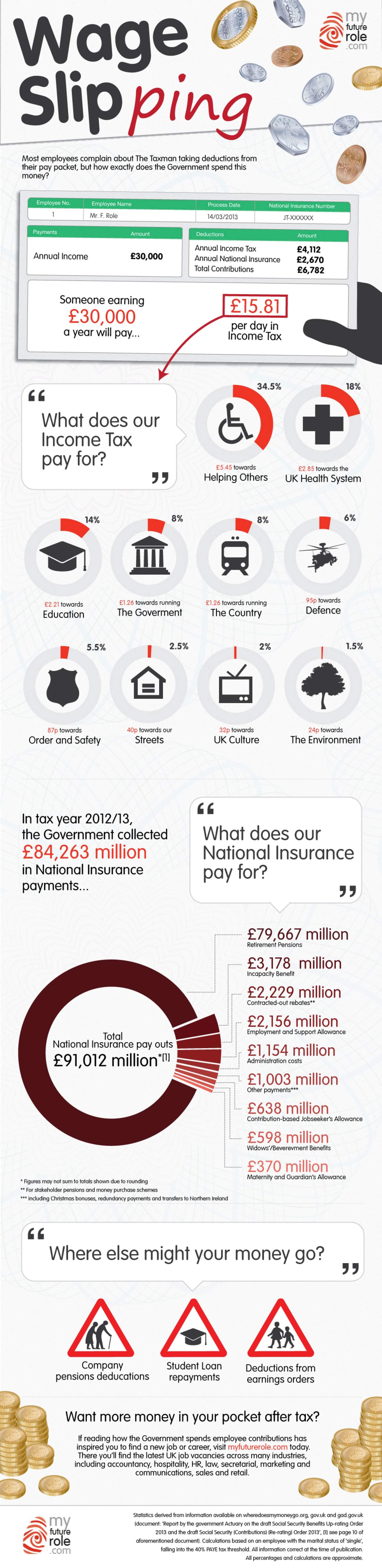
source: https://www.myfuturerole.com/
If you’ve ever wondered where all the money from taxation goes then this will clear things up.
[/well]